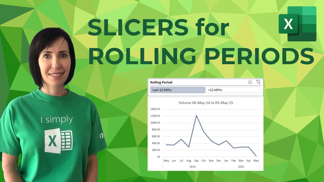
Excel Slicers for Rolling Periods - My Online Training Hub
video description
Date: 2022-04-08
Related videos


Comments and reviews: 9
CONAN-FA18
FRUSTRATING QUESTION? I am looking for instruction on how to make a table, that will calculate the percentage of time that aircraft flights are cancelled, based on different categories. For example, 11/1/19, a flight was cancelled for RAIN...then on 11/2/19, a flight was cancelled for CROSSWINDS...then on 11/3/19, a flight was cancelled for VISIBILITY...and so on. I want to create tables / graphs that show, for example, during the Month of NOV, 33% of flights were cancelled due to RAIN, and 27% of flights were cancelled due to CROSSWINDS, and 12% of flights were cancelled for VISIBILITY. PLEASE HELP???
reply
nancy
Good evening from Texas. I am hoping you can help me with a problem. I have a salesperson dashboard with multiple charts showing different types of monthly performance data. I have one category that I would like to be able to have side by side charts with one showing the current month and the other showing the previous month. My problem is trying to have a separate timeline for that one chart on the dash. It keeps syncing to the main timeline even though it is not connected to it on the options pane. Is there any way to do it with a formula or function on one of the pivot table tabs?
reply
Mathew
Suggestion if i may.
Use Power Query - pull data in, reference that data, remove all column other than date, remove duplicates, sort date newest to oldest, insert Index column from 1,
create conditional column (Rolling 12s), if index is less then 13 = 1st 12 months, if less then 25 = 2nd 12 months,... else older
merge the Rolling 12s query to the data query, (by the date), expand to Rolling 12's column.
connect query to pivot table, insert slicer... you now have a fully dynamic set of rolling 12 filters and labels to use
reply
Matrix
I am stuck. I don't know if you can help me with this this question: How to create a rolling chart with date on column (A) and Data on column (B) to workout the last 12 months or 12 weeks as a total average number or percentage number automatically capturing the data series on excel web data, into work book or spread sheet?-
Thanks . Cheers,
reply
Donna
Great video but how would this work when the data is in a data isn't in the excel but via a data connection. Ive pulled together a pivot to show Turnover but on my dashboard I only want to show a rolling 12 months?
reply
Great video but how would this work when the data is in a data isn't in the excel but via a data connection. Ive pulled together a pivot to show Turnover but on my dashboard I only want to show a rolling 12 months?
reply
Jitendra
Hey hi
I have one problem whenever I add slicer there blank or unknown filter also get added where there is no blank thing in data table. Can u help me here plz
reply
Hey hi
I have one problem whenever I add slicer there blank or unknown filter also get added where there is no blank thing in data table. Can u help me here plz
reply
Anonom2012
This is wonderful! But what is the work-around if the dates are not sorted? Because they come from a data entry table where the data is manually entered?
reply
This is wonderful! But what is the work-around if the dates are not sorted? Because they come from a data entry table where the data is manually entered?
reply
Chris
Fantastic. I've been getting so much from your videos recently, but this one really applies to an exercise I'm working on. Thanks!
reply
Fantastic. I've been getting so much from your videos recently, but this one really applies to an exercise I'm working on. Thanks!
reply
Mzz
This lady is a living legend!
I don't want to bring gender into this, but she should be a role model for all women out there!
reply
This lady is a living legend!
I don't want to bring gender into this, but she should be a role model for all women out there!
reply
Add a review, comment
Other channel videos