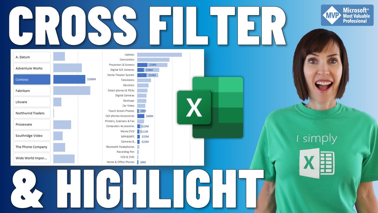
Cross Filter and Highlight Excel Charts like Power BI - My Online Training Hub
video description
Date: 2022-04-08
Related videos





Comments and reviews: 10
Peter
Hello, Fantastic video. Here is a basic question that I can't figure out:
when I create a simple column or bar chart the difference presented with the graph is not proportional to the difference in the actual data. For example if the difference is only 15% the visual presentation shows a much bigger one. I figured I can go in the axis setting and fiddle around with data and make the bars somewhat more relevant to actual data but that is not very intuitive and as soon as data is updated chart is messed up. Any suggestions? Please and thank you.
reply
Hello, Fantastic video. Here is a basic question that I can't figure out:
when I create a simple column or bar chart the difference presented with the graph is not proportional to the difference in the actual data. For example if the difference is only 15% the visual presentation shows a much bigger one. I figured I can go in the axis setting and fiddle around with data and make the bars somewhat more relevant to actual data but that is not very intuitive and as soon as data is updated chart is messed up. Any suggestions? Please and thank you.
reply
RAJNEESH
Hi mam
I have seen and learn lots from your videos and it helps a lot
I have a quary about this tutorial can we make cross fillter chart with 2 diffrent data like production by brand and product code and same is for sale by brand and and sale with product code
I try lot but have so many errors when I make as same
But for only production no error
When I enter sale data not done
Please help
reply
Hi mam
I have seen and learn lots from your videos and it helps a lot
I have a quary about this tutorial can we make cross fillter chart with 2 diffrent data like production by brand and product code and same is for sale by brand and and sale with product code
I try lot but have so many errors when I make as same
But for only production no error
When I enter sale data not done
Please help
reply
Michael
Hi, Thank you for the video, I have a question about chart creation: how can I create a chart (let-s see a line chart) out of two sets of data which have different intervals (for instance, one is monthly data and another is monthly data). I want to put these two sets of data in one chart and it can update automatically once I add new data into the set. Thank you very much!
reply
Hi, Thank you for the video, I have a question about chart creation: how can I create a chart (let-s see a line chart) out of two sets of data which have different intervals (for instance, one is monthly data and another is monthly data). I want to put these two sets of data in one chart and it can update automatically once I add new data into the set. Thank you very much!
reply
Bernhard
This is really great work. I am enjoying every single lesson that helps me a lot. When I tried the Cross Filter and Highlight Excel Chart I could not create the relationship in PowerPivot as I got an error saying - String Review Relationship between ODSource and ProdLookup is a many to many relationship which is currently not supported. Any help is much appreciated
reply
This is really great work. I am enjoying every single lesson that helps me a lot. When I tried the Cross Filter and Highlight Excel Chart I could not create the relationship in PowerPivot as I got an error saying - String Review Relationship between ODSource and ProdLookup is a many to many relationship which is currently not supported. Any help is much appreciated
reply
AlterMind64
Again, your videos are impressive concentrations of golden tips, efficiency in delivery and real learning experience, also for most savvy Excel users ! And this tutorial unleashes yet a few more precious capabilities of Excel that, once again, you successfully shared in a very understandable way ! You deserve a giant praise.
reply
Again, your videos are impressive concentrations of golden tips, efficiency in delivery and real learning experience, also for most savvy Excel users ! And this tutorial unleashes yet a few more precious capabilities of Excel that, once again, you successfully shared in a very understandable way ! You deserve a giant praise.
reply
Hendra
Hi Mynda, I wonder what excel do you used in the video? I mean, is it Excel Office 2019. Coz it's different display with my Microsoft Office Professional Plus 2019.
But overall, I really likes your tutorial, tips and tricks for excel, especially coz not using vba or macro.
reply
Hi Mynda, I wonder what excel do you used in the video? I mean, is it Excel Office 2019. Coz it's different display with my Microsoft Office Professional Plus 2019.
But overall, I really likes your tutorial, tips and tricks for excel, especially coz not using vba or macro.
reply
Graph
Sales data demo-s are fine and dandy, but there is a whole lot of excel and bi being used in healthcare that it would advantageous to use those datasets in examples.
I mean how many times do we need to look at widget sales when we have meaningful healthcare date to look at?
reply
Sales data demo-s are fine and dandy, but there is a whole lot of excel and bi being used in healthcare that it would advantageous to use those datasets in examples.
I mean how many times do we need to look at widget sales when we have meaningful healthcare date to look at?
reply
Thao
Thanks for sharing! Please hepl me, i can't figure out: when i add slice, my pivot table only show selected rows , not all (unsectected brands not showed).Thank you,
reply
Thanks for sharing! Please hepl me, i can't figure out: when i add slice, my pivot table only show selected rows , not all (unsectected brands not showed).Thank you,
reply
Feng
Thank you for the fantastic video Mynda! I have one question on inactive relationship. What-s the reason for using inactive relationship vs active? Thank you!
reply
Thank you for the fantastic video Mynda! I have one question on inactive relationship. What-s the reason for using inactive relationship vs active? Thank you!
reply
Mapafrasko
Thanks again Mynda.
Hi Mynda, How about when my date is on column and not by Row? all of samples I saw on your videos are dates were per row line.
reply
Thanks again Mynda.
Hi Mynda, How about when my date is on column and not by Row? all of samples I saw on your videos are dates were per row line.
reply
Add a review, comment
Other channel videos



 17:8
17:8